It is normal that some characters are narrower than other characters. The cursor position does not need to be the same position at the ruler when fonts are proportional.
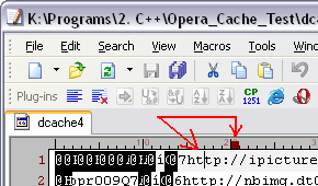
The font is not proportional. It’s the old good Courier New. Actually, the problem is not that the characters are different (though it is very inconvenient), but that such characters become overlapped, and the text is nearly unreadable. For example, on the same screenshot you can see that in the second line the 3rd character (“o” in “opr009Q7”) is half-visible.
I have an impression, that you just use wrong width displaying such control characters. Example:
Suppose, the file contains the 0x01 byte and is opened in Binary (ASCII) mode. To display it, you use the inverted “A” character (suppose, its width is 10 pixels for the current size selected). But the width of the 0x01 control character (specified in the font) is less than that if the “A” character (for example, 8 pixels), and you use these 8 pixels to display the 10-pixels wide “A”. And that’s the reason why the next symbol is overlapped with this “A” character.
So, here’s my vision of what’s happening. Am I right or not? In any case, characters should not overlap.